Periodic Table App
Case study
Overview
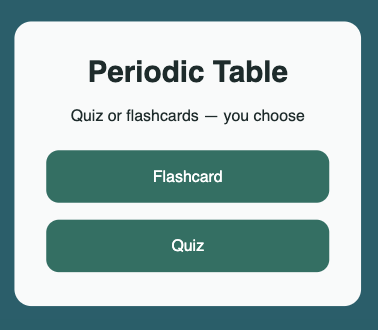
A mobile-first learning tool for the periodic table, rebuilt from an earlier project after studying User Experience Design (UX). The app offers two modes, flashcards with self-rating and a multiple choice quiz, designed to suit different learning styles and moments.
The origin
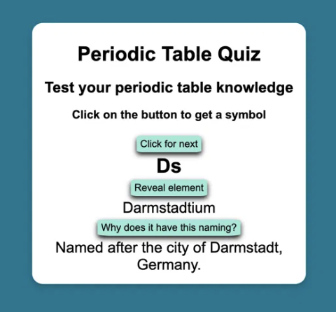
The original version started as a practical solution. My daughter was revising for a chemistry test and needed a way to drill element symbols. I built a basic flashcard app quickly. It worked, but it was rough. Buttons were unstyled, there was no layout structure, no progress tracking, and only one way to use it.
You can see the original version below.
When I started studying User Experience Design (UX), I came back to it. It became the first project where I deliberately applied a UX process before writing a single line of code.
The problem with the original
Looking at it critically, the original had several issues. Content stacked down the page as you clicked through, with no sense of where you were in the sequence. There was no way to test yourself, only to reveal answers. The interface gave no feedback and asked nothing of the user. It worked as a prototype, but not as a product.
The process
I started in Figma rather than code. I defined a clear v1 scope, two modes, mobile first, no feature creep, and built a design system first: colour styles, text styles, and a consistent component approach. Accessibility was checked at the design stage using the Stark plugin, which caught a contrast failure on the primary button colour before it ever reached the browser.
Eight screens were designed and accessibility-checked before any code was written. This was a deliberate change in my working practice, previously I would have reached for the code immediately.
The build
The app was built in React and TypeScript with Vite, deployed on Netlify.
Key decisions made during the build:
- Flashcard self-rating (Got it / Nearly / No idea) was added during development, a UX improvement identified when thinking through the actual user flow rather than just the happy path
- Rating data is currently not aggregated, a known limitation and a clear v2 candidate alongside localStorage persistence
- Quiz mode uses randomised questions from the full 118 elements, with guaranteed unique options per question
- Utility functions and all three main components are covered by unit tests using Vitest and Testing Library, with coverage reporting configured
Progressive Web App
After launch, the app was extended to work as a Progressive Web App. Rather than packaging it for the App Store, a PWA was the deliberate choice: no review process, no annual developer fee, and implementing it properly is a stronger demonstration of front end craft than wrapping a React app in a native shell.
The Vite PWA plugin handles the service worker and manifest. The app can be installed from Chrome on Android via the browser menu, and from Safari on iOS via Add to Home Screen. Once installed it opens without browser chrome and works offline after the first visit.
What I learned
Designing before coding changes the quality of the decisions. Issues that would have required refactoring, like the contrast failure, or the button layout after reveal, were caught and resolved in Figma in minutes. The build phase was smoother as a result.
I also noticed that even with a design in place, implementation reveals things the design doesn't anticipate. The rating buttons were not in the original Figma when the Revealed screen was first designed. They emerged from thinking through the flow during development. The design was updated to reflect the real behaviour before the code was merged.
What's next
Version 1 is complete. Planned improvements for future versions:
- Aggregated flashcard rating results at the end of a session
- localStorage persistence so progress is saved between sessions
- Category filtering to focus on specific element groups
- Hard mode for the quiz, with more similar wrong answers to increase difficulty